Menu Redesign
Improving the navigation of openmindschool.org
Role
UX Researcher at Open Mind School
Methods
Card Sort, Web Analytics
Deliverables
Report, Sitemap, HTML/CSS Code
Context
Open Mind School is a small private school in Silicon Valley founded on a principle of inclusive and individualized education. At the time of my joining, there were no personnel dedicated to managing their website and digital presence, which was strung together piecemeal over time. As a result, there were large inconsistencies in the design between pages and bloating in the overall menu structure. Parents would often email or call Open Mind School’s administrators to receive information (on enrolling, upcoming events, etc) that was available on the website.
I was tasked with a general mandate to improve and maintain the website. Through an initial heuristic evaluation I knew that the information architecture would ultimately need to be revised, but my first step was to establish Google Analytics so that we could start getting a handle on the website’s usage. While waiting for data to accumulate, I worked in the following months on reducing inconsistencies between design elements (fonts, colors, spacing), modifying the HTML markup and alternative text to be more accessible for screen readers, and conducting informal interviews with staff to learn about the school and how the website might further its goals.
+71% Page Views, +54% Users
Result
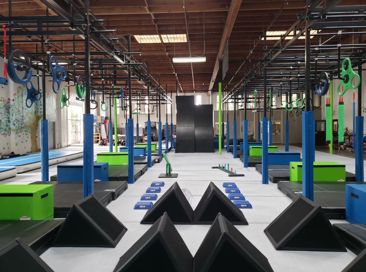
Inside Open Mind School’s gym
Method
With some baseline data under my belt, I then shifted to tackling the website’s menu. Based on the interviews with staff and from the emails and phone calls administrators were getting, I determined that our primary users were 1) parents of current and prospective students, and 2) current and prospective staff members. From these populations, I recruited 13 people to participate in an open card sort. Card sorting is a research method in which participants are asked to create their own structure of a website—their own site map—given a list of all items of content. This is useful for exploring the mental models of users and how items are intuitively grouped. A card sort is considered open when participants are free to name their own categories for the different items.
A coworker and I created lists of the items that should be included in the card sort, and then I compared the two lists to produce one containing 37 items. The wording and syntax of the items were sometimes changed to avoid shallow matching (for example, ‘OMS Partners’/’List of Staff’ instead of ‘OMS Partners’/’OMS Staff’). The card sort was conducted online using kardSort and analyzed using SynCaps V3.
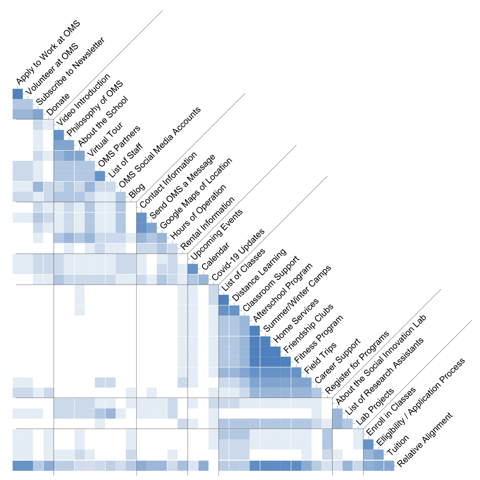
Similarity matrix grouping 37 items from an open card sort into 7 categories
Results
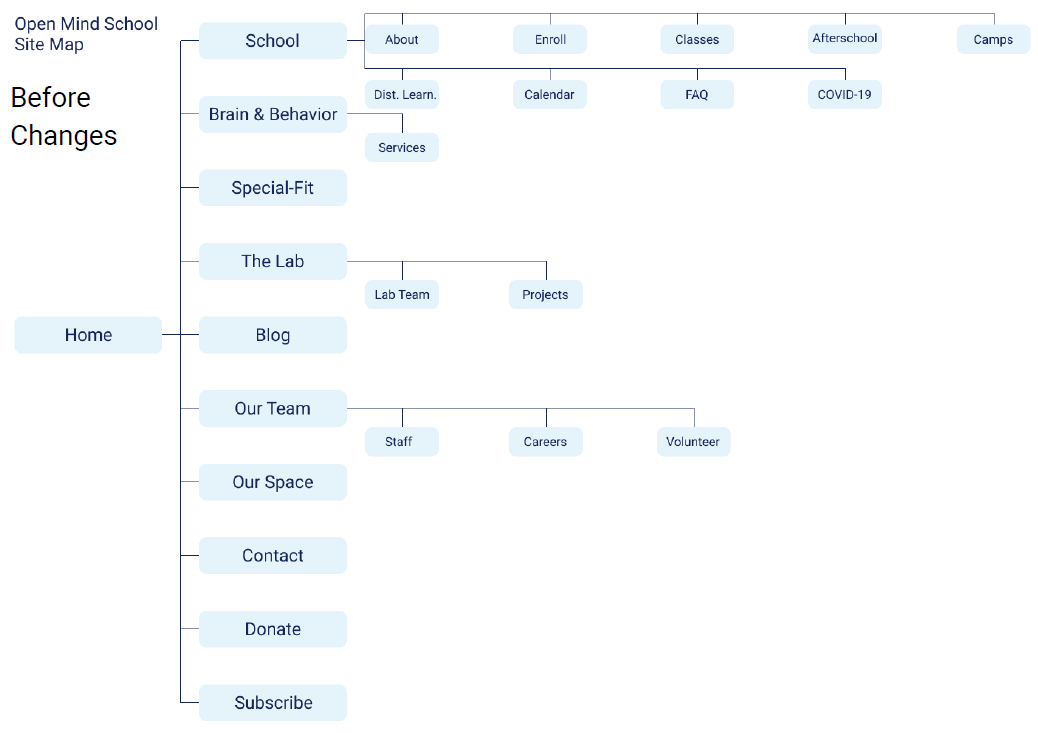
Participants created an average of 7 groups (sd = 2.08). (Perhaps coincidentally, this mirrored psychologist George Miller’s adage that the average person has a short-term memory capacity of seven, plus or minus two.) The full classification of items can be seen in the similarity matrix above. The results were then discussed and used to produce a revised sitemap, shown below. In total, the existing sitemap had 10 main headings and 15 subheadings. The revised version has 7 main headings and 12 subheadings.
A few main differences stick out. many of Open Mind School’s extracurricular activities got grouped into a new category, “Programs.” The subheading “careers” was promoted to be a main heading. Finally, the calls-to-action (“contact”, “donate”, “subscribe”) were removed from the menu and added to relevant web pages as buttons.
Sitemaps before and after changes informed by the results of a card sort
Measuring the impact over time
After 6 months with the revised menu, I went back to analyze the effects of the intervention. My assumption was that if the information architecture improved, then there would be 1) a lower bounce rate, and 2) more web traffic.
First, there was only a mild decrease in bounce rate, from 56% to 53%. This was partially explainable by blog posts with very high individual bounce rates skewing the average. If people visited the website just to read an article, then it makes sense that they would be more likely to leave without using the menu. Still, this result was disappointing.
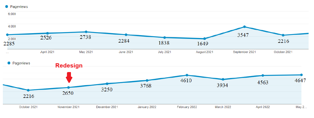
Metrics of web traffic were considerably more positive. Monthly mean page views increased 71% from 2415 (n=9) to 4128 (n=6) after the redesign. Similarly, monthly mean users increased 54% from 679 (n=9) to 1046 (n=6) after the redesign.
Lastly, an administrator happily reported that they received less communication from parents asking for information available on the website.
Page views from March 2021 - May 2022. Page views increase steadily after the implementation of the redesign in November 2021.
Users from March 2021 - May 2022. Users increase steadily after the implementation of the redesign in November 2021.
A note on correlation and causation
People with a background in the social sciences will inevitably have heard the phrase “correlation does not equal causation.” This study, which looked at metrics pre- and post-intervention, is not experimental because it doesn’t have a control. This means that we cannot rule out that something other than the menu redesign caused web traffic to increase. For example, I made cosmetic changes (colors, fonts, spacing) throughout the time period. Although the beginning of the upward trend appears to coincide neatly with the menu design, it’s possible that aesthetic improvements also contributed to the results.
Time of year did seem to impact web traffic. Indeed, because this is a school website, page views were particularly low in the summer vacation months and then spiked in September when students returned. Nevertheless, I believe there is solid evidence that the menu redesign was beneficial. Specifically, limiting the comparison to just the 3 months for which there are data from both years (March, April, and May), a similar pattern emerges where page views increased by 74% and users increased by 99%.


